
As eCommerce stores continue to grow in complexity, it becomes increasingly important to simplify the checkout process. Too many elements on a page can overwhelm shoppers and cause them to abandon their purchase. That’s why it’s so important to make cuts to your checkout cart page’s design.
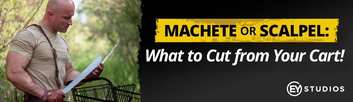
What kind of cuts are we talking about? Like I always say, sometimes you have to use the scalpel for precision cuts, and sometimes you need to machete your way through a jungle of bad design. While we also dual-wield both blades on layouts, I’m going to classify the below five cuts by what we usually do to fix problems.
1) Get rid of needless cart clutter.
One of the most common cart design layout challenges we see are nonessential details. I would classify “cart clutter” to mean anything that does not keep customers in the checkout funnel—with the obvious exception of a “Keep Shopping” button. This means all the stuff you’ve crammed into your header and footer before the cart step needs to be re-evaluated. Do you really need your privacy policy, links to your social media pages, and a newsletter promotion in your cart?
Like any other layout on your store, you must determine the primary action you want customers to make. With something as important as checking out, eliminating distractions is critical. Otherwise, you’re unintentionally giving shoppers reasons to fixate on something else that doesn’t involve getting their wallets out.
Classification: Machete
2) Keep urgent updates to a minimum.
Speaking of clutter, let’s discuss those common “urgent updates” that are often placed at the very top of the cart page. These were everywhere during the pandemic, and they’re still present with current supply chain shortages. With the holidays coming up, shipping deadline paragraphs are ubiquitous on many eCommerce carts.
I’m fine with these updates if they can be addressed in one line that potentially links to a separate information area that can spell it all out in more detail. However, if you’re writing a novel that pushes the contents of your cart page out of sight, you have a problem. No one will read it, and it adds unnecessary tension to a layout that doesn’t need it. While you may be protecting your company with this update, realize the added responsibility of protecting conversions.
Classification: Scalpel
3) Close the deal by addressing common questions.
Like any type of sales, you want to address typical areas of pushback that customers have related to shipping or customer service. Most eCommerce businesses understand this, but they go about this in an unintuitive manner that throws the cart layout out of whack. They’ll often spread contact methods, FAQ, and returns info all over the page, which creates a disorienting effect on the user.
Customers need to recognize one main area for information so that they don’t confuse it with what is required to begin checking out. We have seen a lot of success from what we call a “confidence column”: a single space that usually contains three key bits of information. When you’re automatically addressing what may concern a user, this builds emotional confidence that can positively impact the rest of the experience.
Classification: Scalpel
4) Be clear about payment methods in the cart.
When displaying which payment methods are available for a customer, cart pages often vacillate between where and how this is achieved. For example, I can’t tell you the number of stores I’ve come across that do not list PayPal as an option until the payment page. Conversely, some will list PayPal up front, but they neglect to clarify that a customer can also only pay with their credit card. Since there are a variety of stores that offer either exclusively PayPal or use it in conjunction with other payment options, clarity is required.
If you do have a standalone merchant account, be sure to brand it with adjacent credit card icons. Otherwise, your checkout button will look pale in comparison to the more colorful PayPal or Amazon logos (or whatever else you offer). One of the main jobs the cart page has is to establish which payment funnel a customer would like to enter. While this seems to be a simple task, poor design here is usually one of the most egregious reasons for cart abandonment.
Classification: Dual-Wield Scalpel and Machete
5) Make sure your cart buttons are clear.
We know you’re proud of your neon green brand colors but think twice about also making your cart buttons match the neon greatness. If payment method confusion is a persistent villain in cart conflicts, poorly designed buttons are the final boss that you have to destroy. When you simultaneously brand a non-clickable background elements with the same color as “Proceed to Checkout,” you have a problem. The problem metastasizes when you throw nineteen other buttons on the cart page—all colored the same way.
The solution is found by intentionally selecting a color that compliments your color scheme without blending into it. This avoids the effect of a stultifying cart presentation and helps the eye focus on where it needs to click. When fixing this problem, make sure it extends back to the product page so that the Add to Cart button flows into this intuitive usability approach.
Classification: A Very Big Machete
—
These are only a few of the issues we see in carts all too often. If you’re interested in learning more or want to get a second set of eyes on your cart design, reach out to our team. We’d love to help you increase conversion rates and decrease cart abandonment.